My magazine will be called "Pariah"
I was unsure about my magazine title font. I could either research into fonts online and then printscreen them and upload it onto my cover or use a font that is already on photoshop.
I could choose a font where its in the style of being an outcast/lawbreaker which would be a graffiti sprayed on look, like this:

or a type writer font, like the perks of being a wallflower movie title. Although my magazine is quite modern, the old fashioned type writer theme would tie in with being different, and alternative. This is an example:

Lastly i could just have a plain bold font . For exapmle arial black. I do have an idea in mind about having the left side quarter of the page black, then having the title black at the top, but the "P" in PARIAH white. So that the P, stands out. Like Fader magazine but the stripe goes all the way down.

REFRENCES:
PERKS OF BEING A WALLFLOWER:

I could choose a font where its in the style of being an outcast/lawbreaker which would be a graffiti sprayed on look, like this:
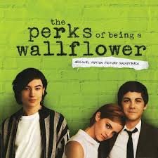
or a type writer font, like the perks of being a wallflower movie title. Although my magazine is quite modern, the old fashioned type writer theme would tie in with being different, and alternative. This is an example:
Lastly i could just have a plain bold font . For exapmle arial black. I do have an idea in mind about having the left side quarter of the page black, then having the title black at the top, but the "P" in PARIAH white. So that the P, stands out. Like Fader magazine but the stripe goes all the way down.
REFRENCES:
PERKS OF BEING A WALLFLOWER:
FADER:
Ok for an idea, but I think you need something much shorter in order to catch the reader's attention. Come up with some more ideas please!
ReplyDelete